
2020–2023
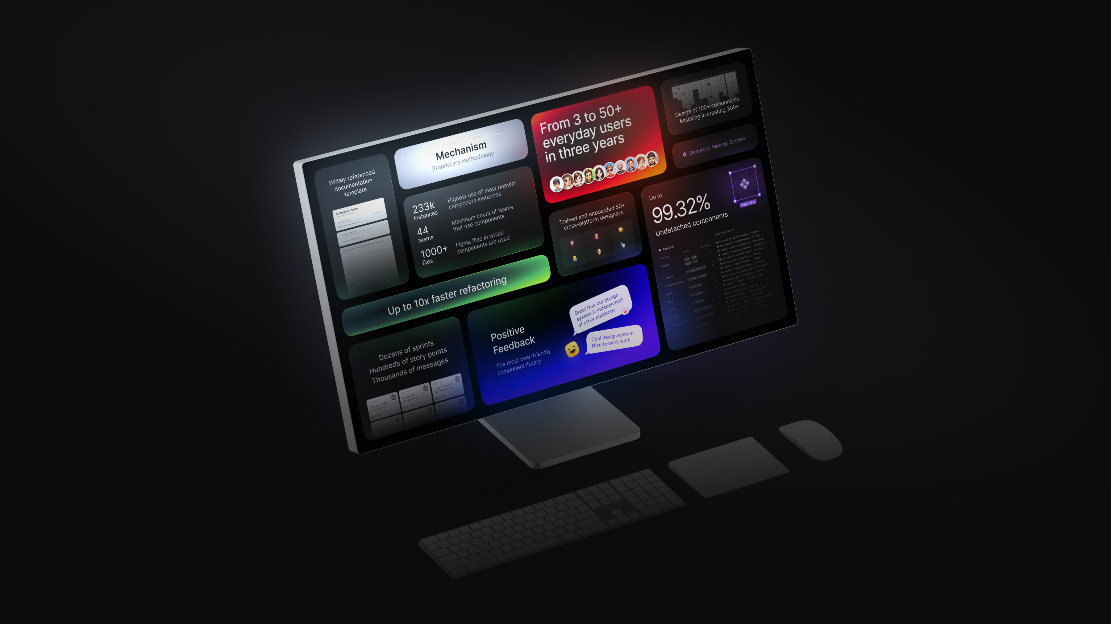
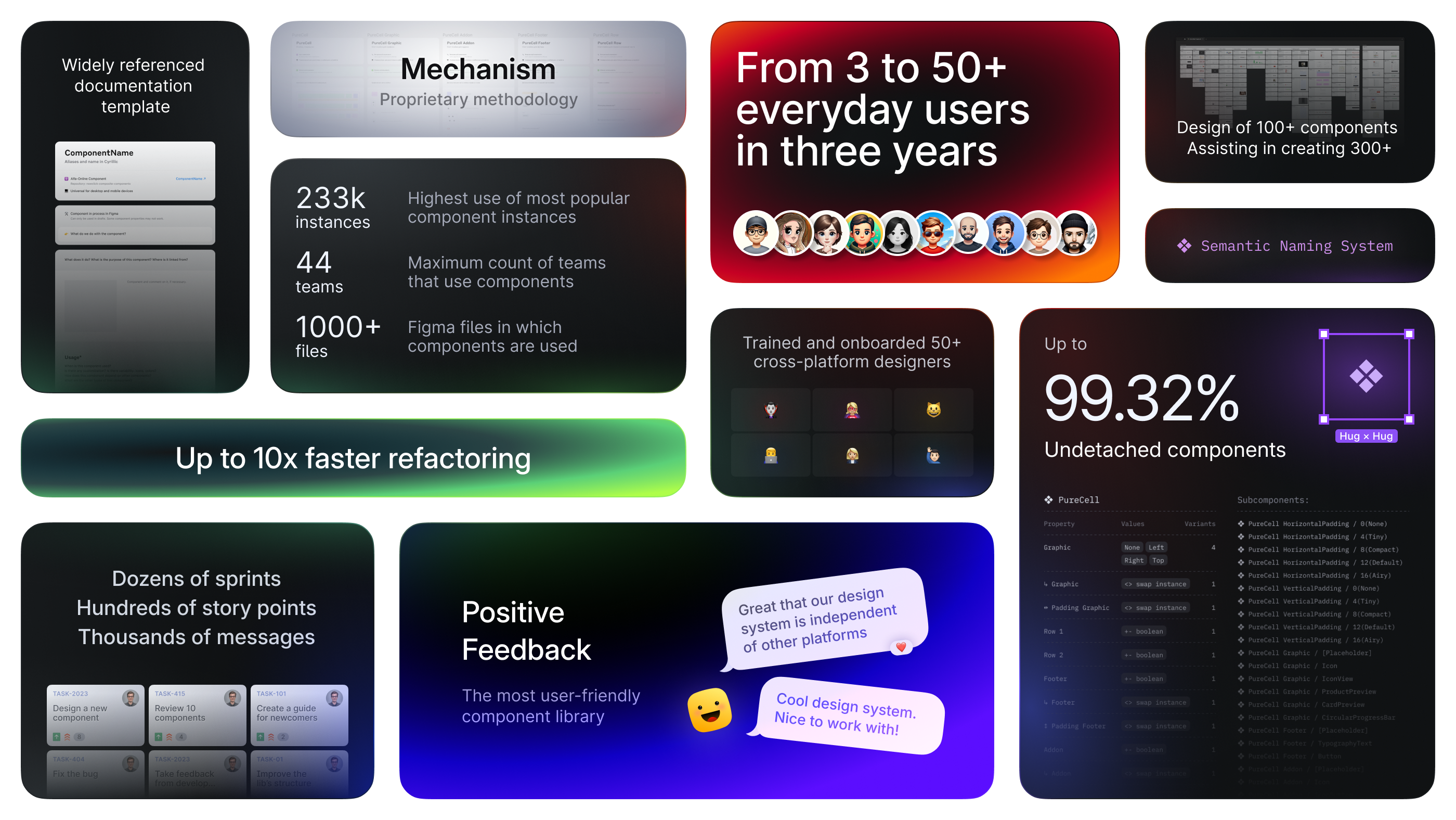
I will start with my role as a solo designer who built a component library from scratch, growing its user base from 3 to 50+ in 3 years, and established library standards.
Then, I will describe my role as lead designer who managed the design system team and found essential tools and processes for creating an enterprise-scale component library utilized by 44 teams and over 1,000 files.
At the beginning of Alfa‑Online’s creation, no designer was responsible for the components. Only three product designers maintained the component library in their limited free time from product tasks. Therefore, they needed me to make the library complete and consistent.
I aimed to develop the tools and processes designers and developers need to build top‑level user experiences on any device.
My Objective
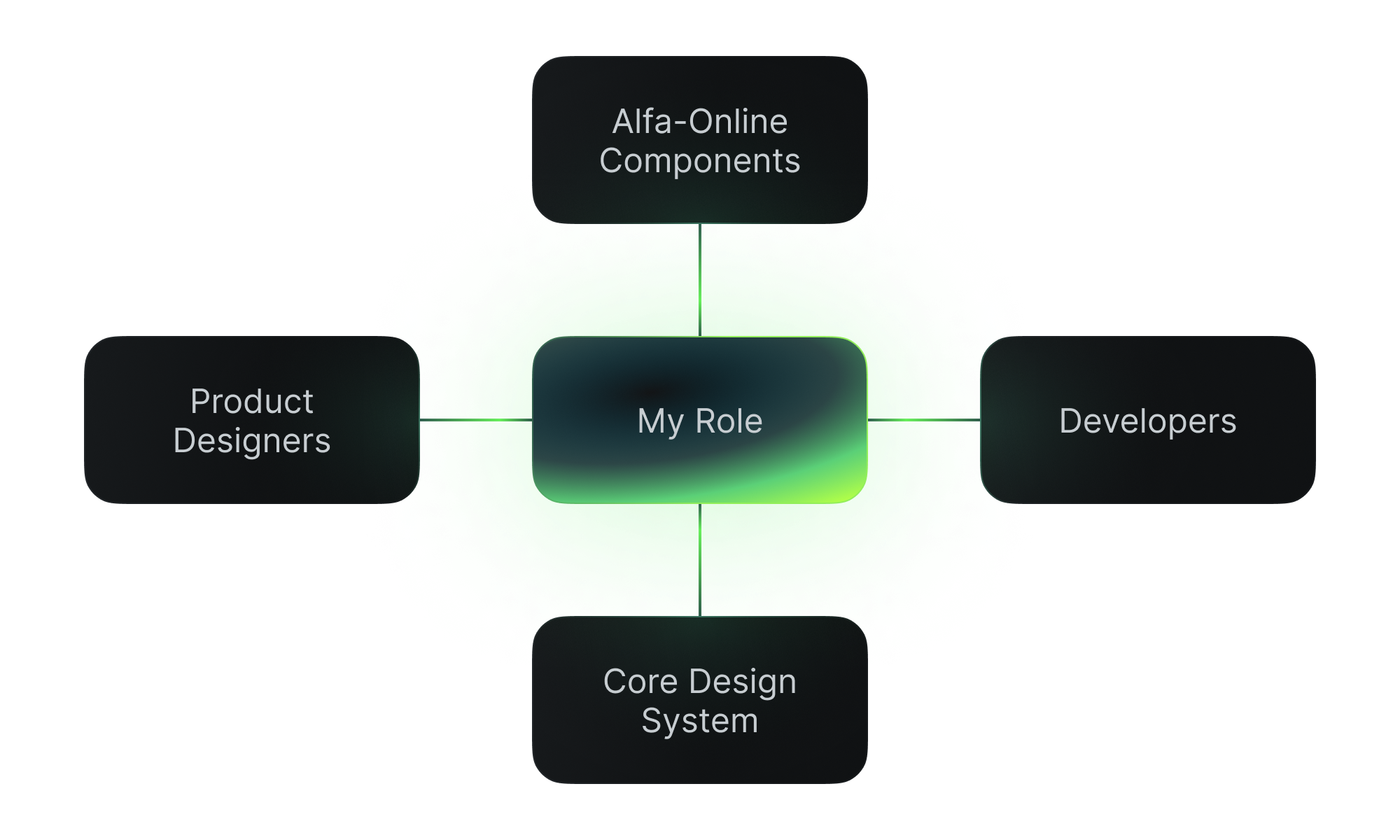
As a Component Library Designer, I worked closely with product designers and developers.
My permanent task was to bridge the gap between design and code. My knowledge of HTML, CSS and JavaScript fundamentals helped me collaborate better with developers.
I also connected our product team and the core design system. Alfa‑Bank has many directions like B2B, investments, mobile apps. However, all directions need to respect the principles of the core design system.
My primary task was to create and maintain an enterprise-level component library.
On the one hand, I had first to develop the principles and standards of the library. It is vital for scaling, enhancing, and supporting in the future. On the other hand, product teams were experiencing critical component shortages.
So, I was obligated to do a lot of work quickly but with precision and care. It was a big challenge for me.
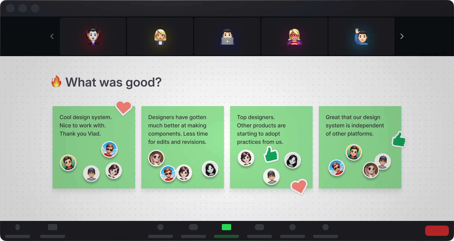
— Lyudmila, Product Designer
Initially, I audited the library and processes and asked for feedback from designers and developers. They helped me determine pain points and disadvantages. Here are the problems I identified.
Hardcode
Local build due to lack of components and detached components due to lack of flexibility.
No documentation
Few instructions. Needs to be clearer on how components work.
Inconsistency
Different components are described in different ways. Need help finding the right component.
Many errors
No control over components linked from other libraries. No established rules for building and naming components.
Little communication
People need to figure out who to contact if questions arise. It needs to be clear how the component library affects teams’ work.
In my opinion, building a solid foundation for future growth is essential because we can’t quickly and easily replace a design system with another one. It is a complex system of components, rules, principles, and processes.

There were two types of components:
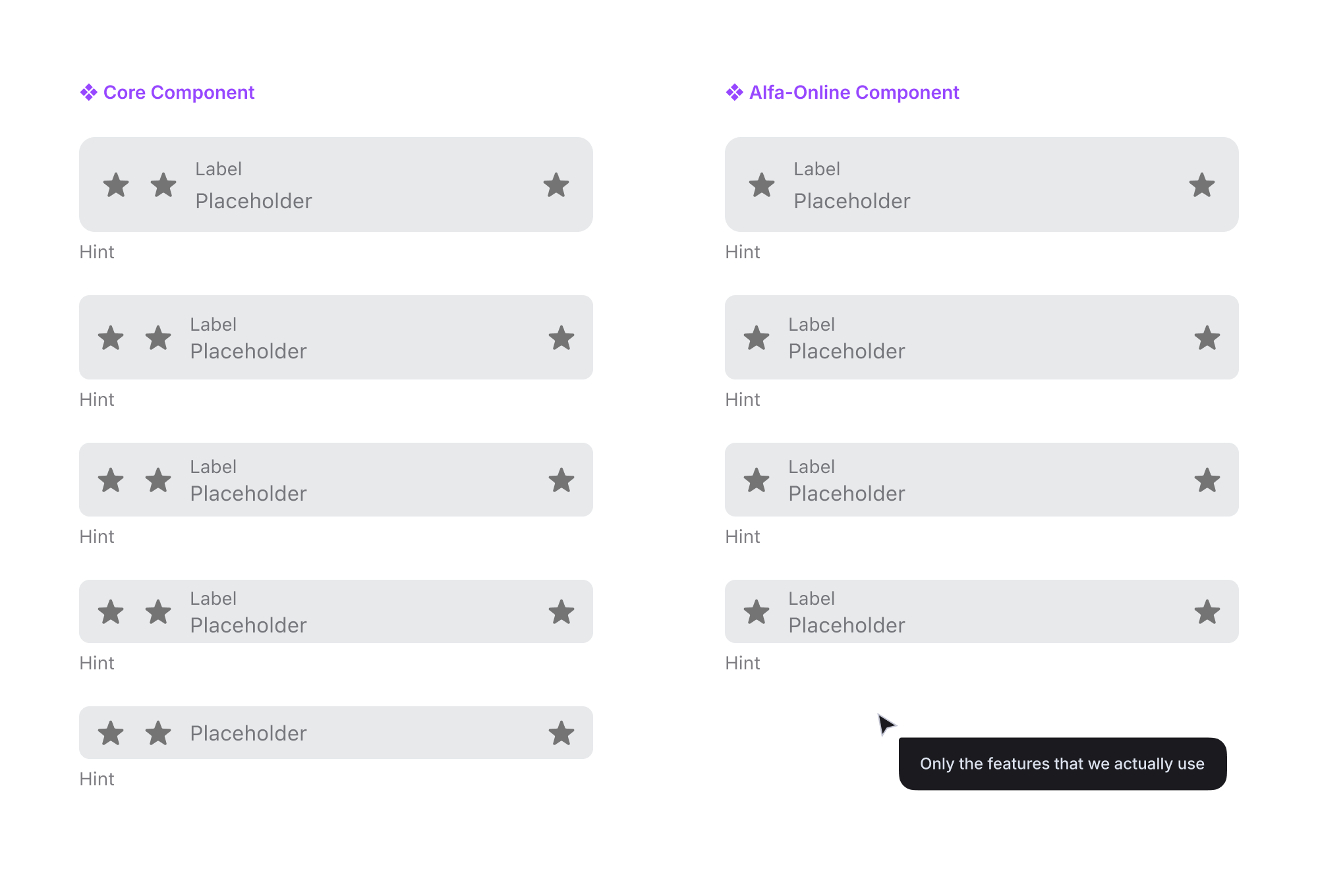
❖ Alfa‑Online components: Only for our needs and our team.
❖ Core components: Any department in the company used them to achieve consistency across different directions and platforms.
However, using components directly from that library was uncomfortable because any change to these components caused a reset to the instances in our files. We had no control over components pasted from the core library.
I offered my team to use components from our library only. We agreed that I was responsible for the quality of the components.
I built those components to be easy to use in everyday tasks.
I also didn’t overload components with features that we don’t use. This approach simplified working with the design system. Moreover, because of this method, I protected the library from common mistakes and cumbersome components.
In addition, some of the components I developed for Alfa‑Online have been transferred to the Core Design System so all the bank’s products can use them.
I have my proprietary methodology for assembly and building components that designers find convenient. My approach to making any components is based on the idea of modularity.
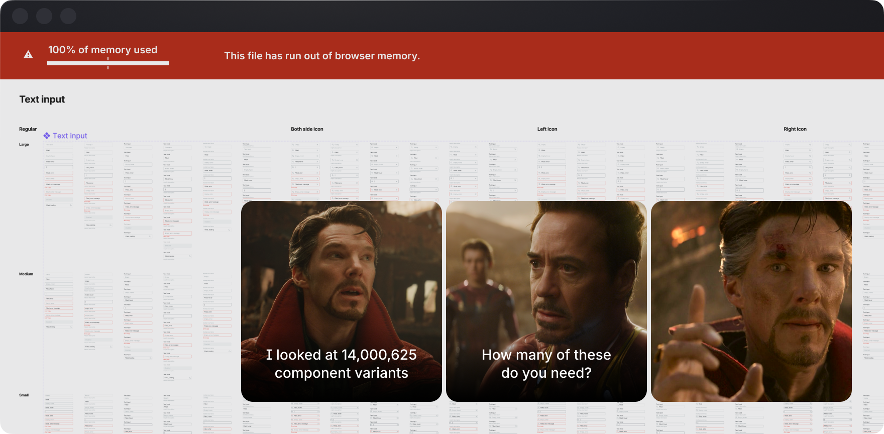
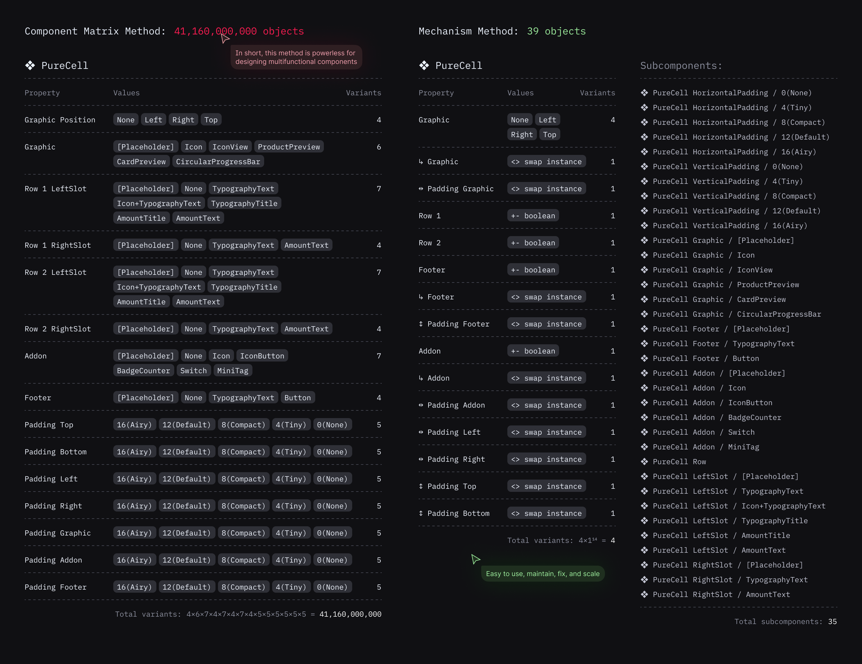
I don’t make bulky components with a massive number of variants. That’s something you see a lot. I call it a Component Matrix. And I don't consider it the best solution for components.
First of all, such components are often ballooned. The number of variants can reach several thousand. It significantly overloads the library. These components are problematic to maintain and change.
In addition, it leads to irrelevant variants. Designers may mistakenly customize the component in a way it should not look like.
My methodology represents a component as a mechanism that is made up of parts.
It reduces the number of variations. These components are easier to use and maintain and almost impossible to misconfigure.
This approach makes adding or modifying each part quickly and efficiently possible. It also allows you to prepare frequently used presets for the parts to complete the work of designers more easily.
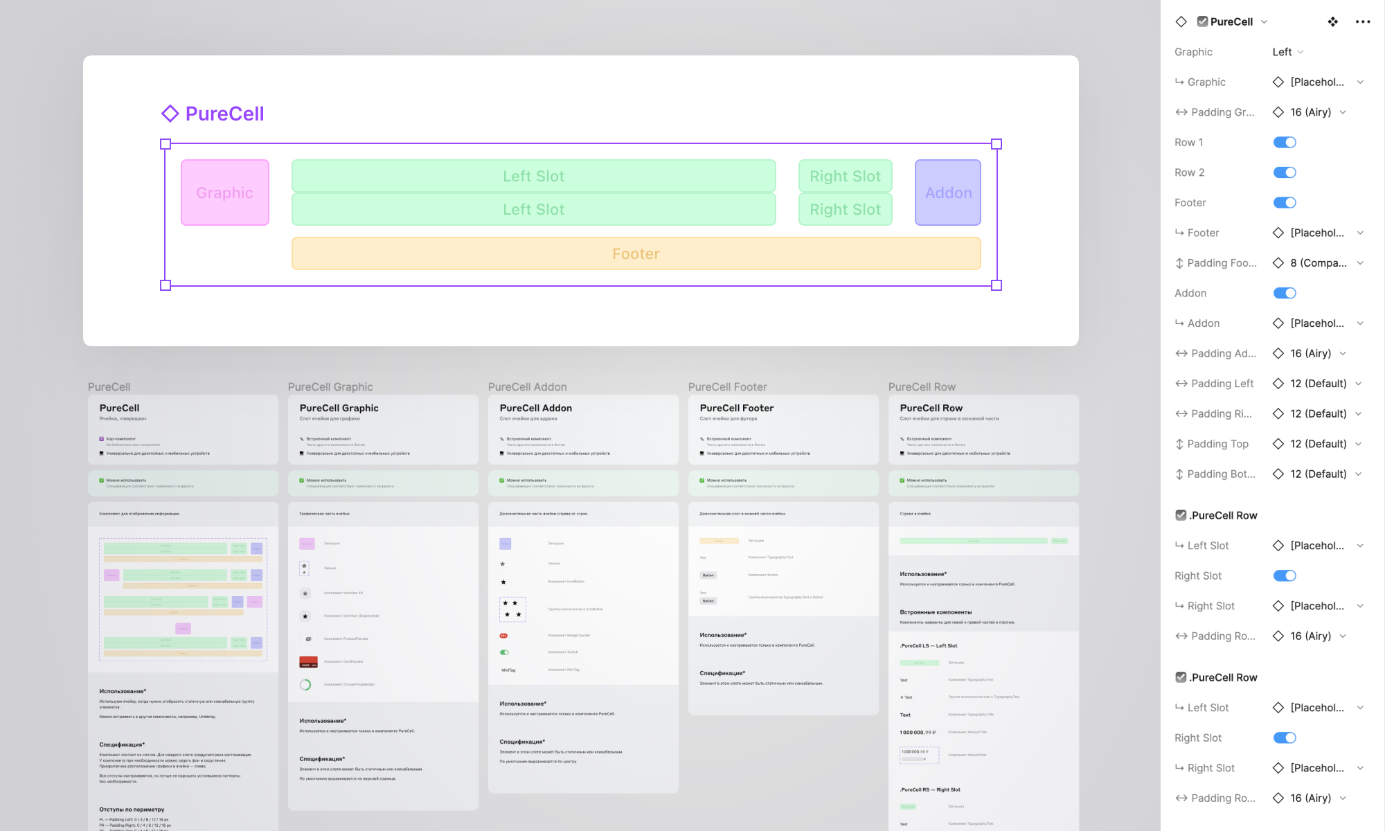
In case of refactoring, rebranding, or unforeseen circumstances, this structure allows me to update the component library faster and return to everyday workflow more quickly.
That’s why, apart from day‑to‑day convenience, my methodology is strategically fortunate.
Over the years, I have honed my building methodology.
I participated in product designer meetups every week and watched them use components in real work. It helped me understand how to build components to make it easier and faster for product designers to use them in their work.
I shared my knowledge and experience in building components with other designers. For example, I hosted meetups every Friday, where designers and developers could come with any questions.
My goal was to provide user‑friendly documentation for designers and developers. So, I collaborated with developers to find out how they can read component specifications most conveniently.
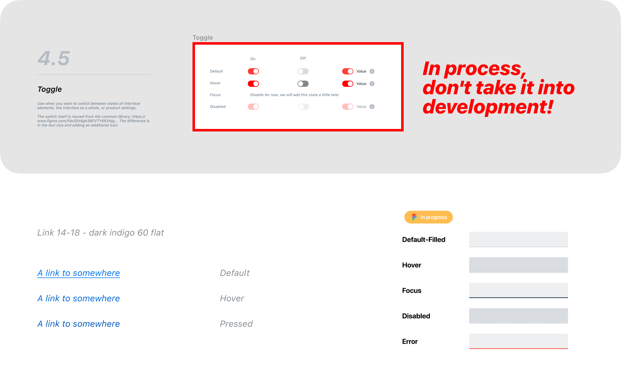
As a result, I developed a universal documentation template that is convenient for everyone. Then, I enhanced and supplemented it. But the main part remained unchanged and is suitable to this day.
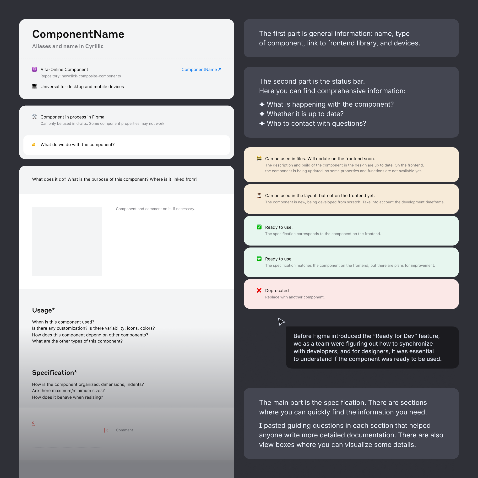
This structure has been praised many times for its convenience and simplicity. Other teams in the bank have borrowed this template. Moreover, my template had a lot of attention when I showed it at the Design Systems Conference.
Thanks to the unified description structure and improvements requested by designers and developers, it was possible to ensure that users of components read all the necessary information as quickly as possible.
The status bar has started to prevent using outdated or unfinished components. The “Usage” section helped to avoid errors in layouts.
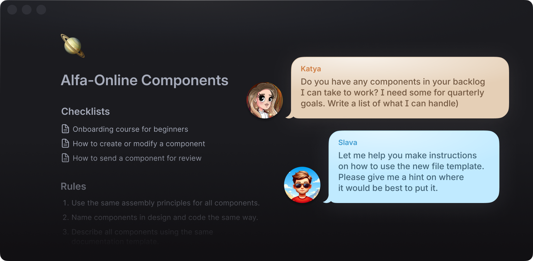
So that all the designers could work cohesively on the development of the library, I also regulated the design processes.
Teamwork on components has motivated me to create lists of defined steps and rules to help everyone work efficiently. For example:
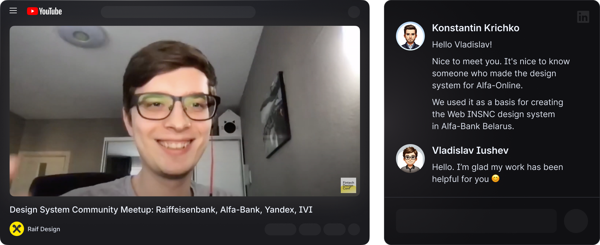
My efforts helped me create a convenient and flexible library. I showed the results of my work personally to the CEO of Alfa‑Bank.
I shared my experience in an online design systems conference with colleagues from Raiffeisenbank and Yandex.
But most importantly, I received positive feedback about the library from designers and developers inside and outside the company.
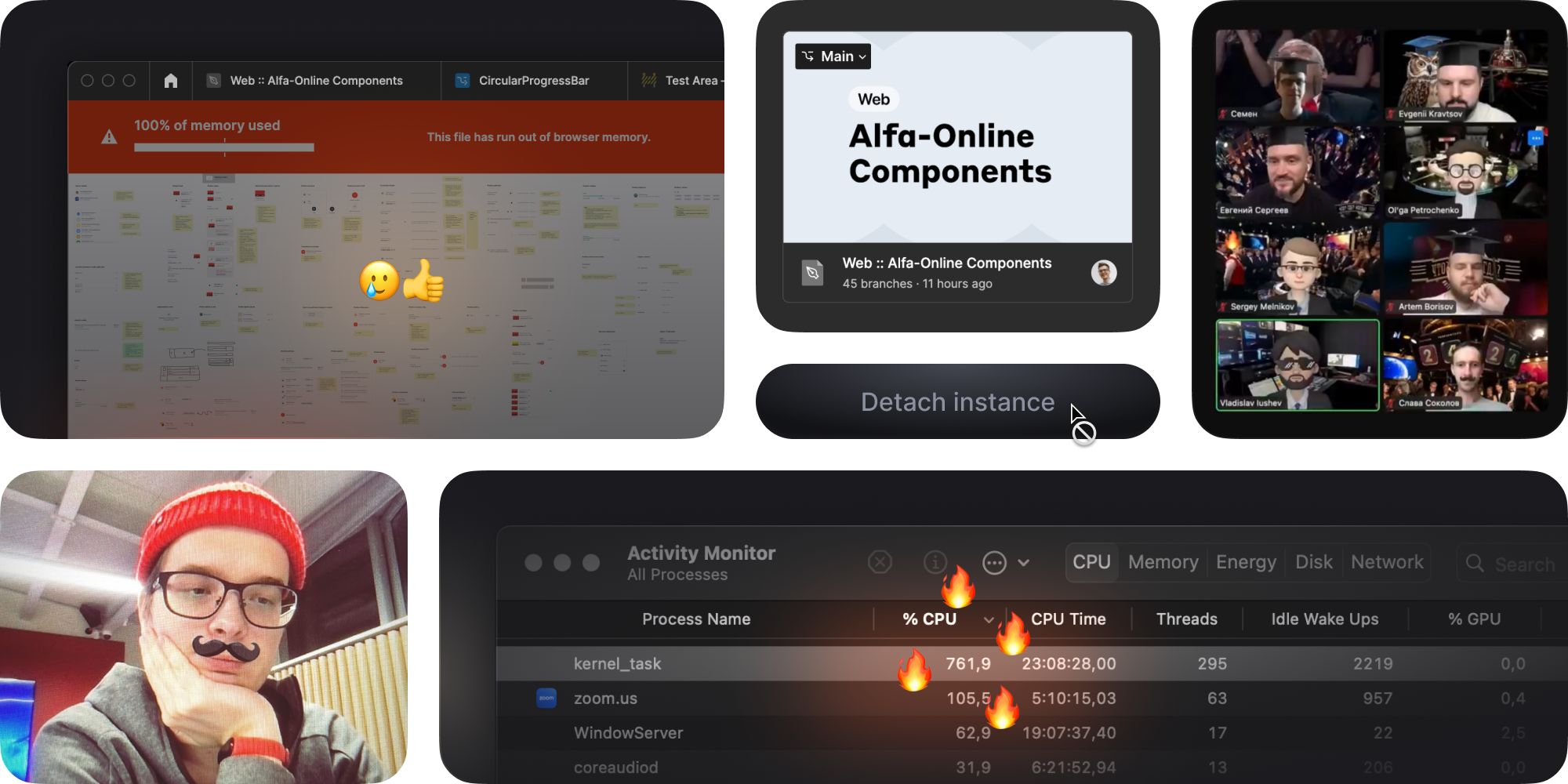
Alfa‑Bank’s designers offloaded thousands of files and restored them to the new account. My job was to revive the library, fix the detached tokens, and get the components working again.
My approach to library structure and component assembly came in handy in this case. I saved my team from unnecessary refactoring.
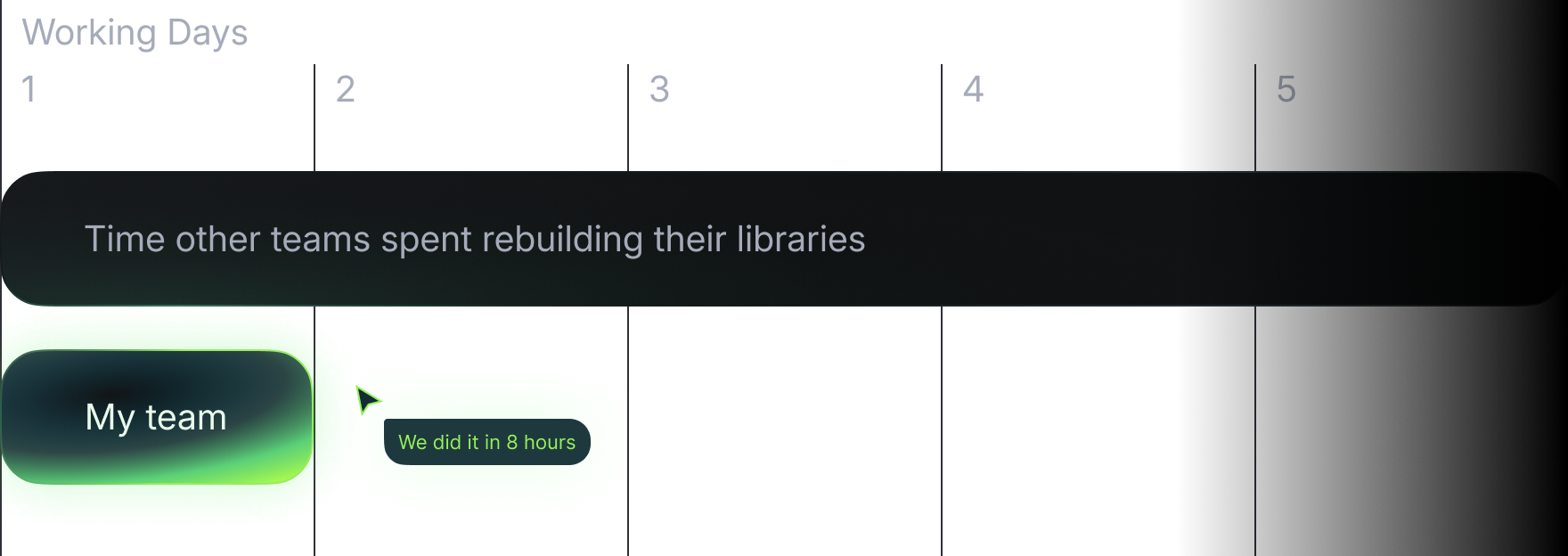
Thanks to the interconnected structure, it took only 8 hours for my team to rebuild a library of over 200 components. In comparison, other teams took about a week to rebuild their libraries.
By April 2022, the teams were divided by platform:
But in March 2022, all designers became cross‑platform to speed up the development of the mobile version of Alfa‑Online.
Such an influx of new people demanded extra attention from me. I had to onboard new designers, tweak processes, and ensure the library evolved while maintaining quality.
Over the next six months, designers increased to 50+ people. It was transparent that such a load on me alone was colossal.
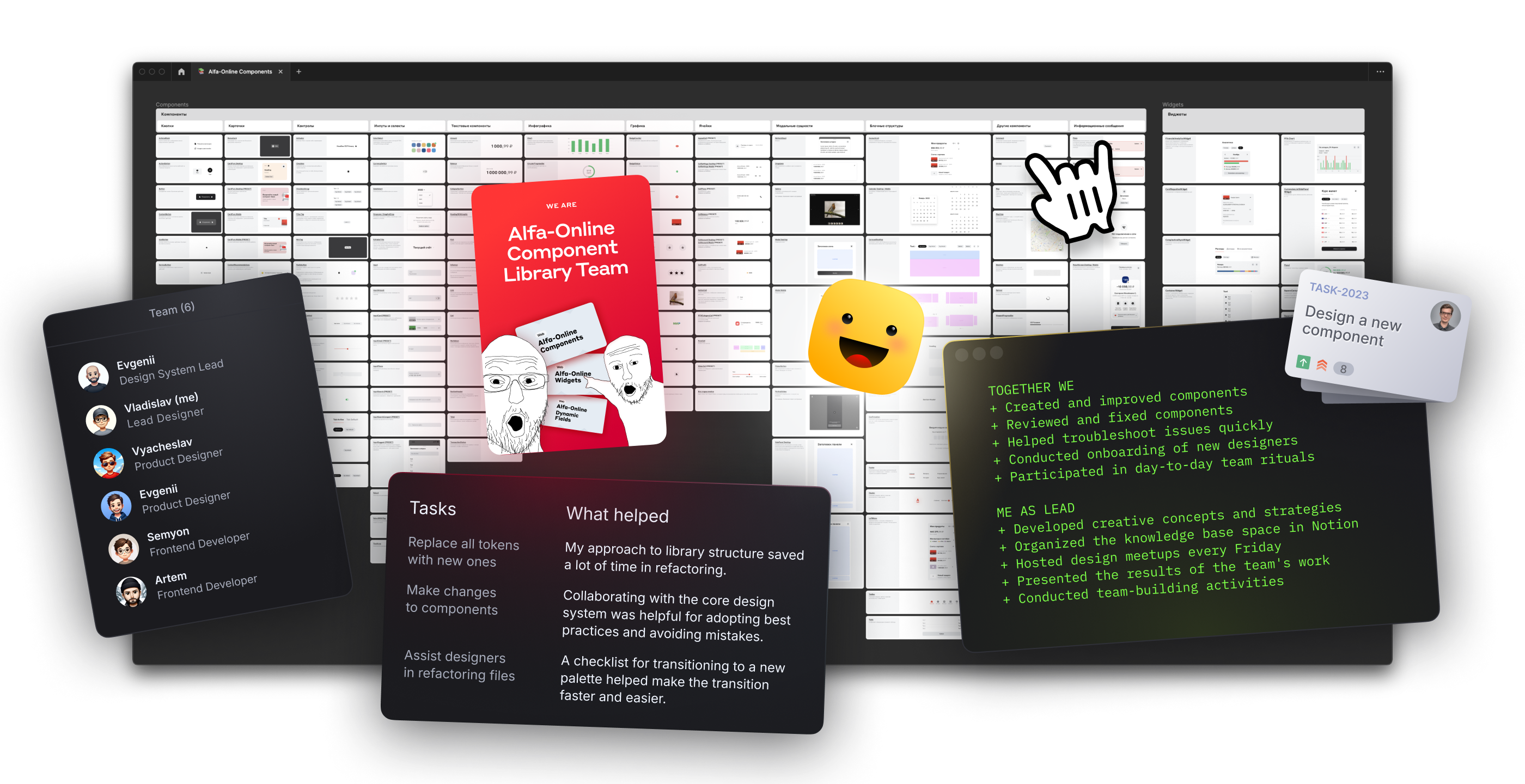
Therefore, in November 2022, the Alfa‑Online component library team emerged: me as the lead designer, two products designers and two frontend developers.
The company set out to strengthen consistency between different platforms and areas. The mobile version of Alfa‑Online had to be visually as close as possible to the Alfa‑Mobile app.
This transition caused a refactoring of all of the Alfa‑Online files in Figma. It required switching to a new colour palette and changing the properties of several components.
While we were redesigning, we optimized the components at the same time. We removed unnecessary ones, merged similar ones, and rebuilt them. As a result, we ended up with 134 components, not counting subcomponents.
The most important metric for me is receiving positive feedback from product designers and developers.
Designers appreciated the simplicity and flexibility of the components and other advantages of the Alfa‑Online library. In addition, the opportunity to ask questions at design meetups or in private messages was also beneficial.
Developers thanked me for the detailed specifications and additions to the component description template: links to the storybook, statuses, and additional comments. Moreover, my component description template became a reference for other teams.
In 2020, 5–6 designers and a dozen developers used the library.
In 2023, more than 50 cross‑platform designers and the same number of developers are using the library. In total, our components are used by more than 40 teams in a thousand files.

The number of component insertions has increased so much in three years that it is impossible to count.
Components have been created, modified, deprecated, and rebuilt. Almost all user flows are built on existing components.

The Mechanism build method has proven so convenient that designers avoid detaching components in up to 99.32% of cases.
Even if they need to add features to components, it’s faster and easier than building pages on hardcode.

Initially, a lack of components blocked user screens’ design because some components or features weren’t available. By 2023, all screens were designed with existing components.
The number of errors has decreased thanks to onboarding, training, instructions, and regular syncs. Before, several people came in daily with problems and questions. Now, it’s one person a week.
In addition, experienced product designers now know the answers to many questions and help newcomers.
Qualitative tools and processes reduced tech debt. For instance, the “Mechanism” methodology saved the library from a drawn-out refactoring twice.
My most important project was building and leading this component library, where I could make the design system suitable and convenient for everyone.
Thanks to the principles I laid down from the beginning and the community of product designers, this library has a vast potential for further enhancement.
I appreciate all the designers and developers who helped me to build and maintain this component library.
Special thanks to my team members: Vyacheslav Sokolov, Evgenii Kravtsov, Semyon Knyazev, Artem Borisov, and Evgenii Sergeev.
